Introduction: Bringing a design concept to life on paper is an exciting and rewarding process. However, for a flawless and professional outcome, graphic designers must navigate the intricacies of preparing artwork for printing. In this comprehensive guide, we’ll walk you through the essential considerations and best practices to ensure your designs look stunning in print. From color modes to resolution and bleed, let’s delve into the art of preparing artwork for the printing press.
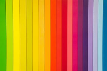
- Understanding Color Modes: RGB vs. CMYK Color is a powerful tool in design, but it behaves differently on screens and paper. When designing for digital platforms, we typically work in RGB color mode, where colors are created by combining red, green, and blue light. However, when it comes to print, we use CMYK color mode, which uses four ink colors (cyan, magenta, yellow, and black) to reproduce a wide range of colors on paper.
The key is to understand how RGB and CMYK colors differ and to adjust your design accordingly. Converting your artwork from RGB to CMYK before sending it to the printer helps avoid unwanted color shifts and ensures the final print matches your vision.
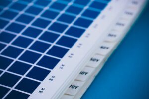
- Choosing the Right Color Profiles: Color profiles are essential for maintaining color consistency across various devices and printers. ICC (International Color Consortium) profiles define how colors should be interpreted and displayed. When preparing your artwork for print, it’s crucial to select the appropriate color profiles, ensuring your design’s colors look consistent from screen to print.
For best results, consult with your print service provider or the print shop to determine the color profile they prefer and ensure your artwork is set up accordingly.
- The Power of Resolution: DPI vs. PPI Resolution refers to the number of dots or pixels per inch and plays a vital role in the clarity and sharpness of your printed artwork. DPI (dots per inch) is the standard measurement for printing, while PPI (pixels per inch) is used for digital displays.
When creating designs for print, it’s essential to work at the appropriate DPI to achieve high-quality results. Generally, 300 DPI is the standard resolution for most print materials, such as brochures, flyers, and posters. For large-format prints, like banners and billboards, a lower DPI might be acceptable due to the viewing distance.
Remember to always design at a higher resolution than what will be used for print to avoid pixelation and maintain image quality.
- Embracing Bleed: Ensuring Seamless Printing Bleed is an essential aspect of print design that prevents white edges from appearing when the final product is trimmed. It involves extending design elements (backgrounds, images, or colors) beyond the trim area, ensuring there are no unsightly gaps after cutting.
Typically, a standard bleed measurement of 0.125 inches (3mm) is used, but some print providers may require more or less. Always confirm the bleed requirements with your printer and ensure that any critical design elements or text are not placed too close to the trim area.
Including bleed in your design not only ensures a polished appearance but also provides some margin for error during the printing and trimming process.
- Paper Types and Finishes: Picking the Perfect Canvas The choice of paper can significantly impact the final appearance and tactile experience of your design. There’s a wide variety of paper types and finishes available, ranging from glossy and matte to textured and specialty stocks.
When selecting the perfect canvas for your design, consider the project’s purpose and target audience. A brochure for a high-end event may benefit from a premium, textured paper, while a modern poster might look best on a smooth, glossy surface.
Consult with your printer or paper supplier to explore the available options and request paper samples to see how your design looks and feels on each type.
- File Formats for Print: PDFs and Beyond Choosing the correct file format is crucial for ensuring that your artwork is accurately reproduced during printing. While designers often work with various file formats throughout the design process, PDF (Portable Document Format) is the preferred choice for professional print jobs.
PDF files retain all the necessary information, such as fonts, images, and color profiles, in a compact format that is easily shareable and printable. To ensure compatibility with the printing process, use the appropriate PDF/X standard, which ensures that fonts are embedded and color information is preserved.
Always review your final PDF carefully before sending it to the printer to confirm that everything appears as intended, including fonts, images, and colors.
- Proofing: The Final Check Before Printing Proofing is a critical step in the print preparation process, as it allows you to detect and correct any potential errors or color discrepancies before going to print. It involves creating a sample of the final print, typically in the form of a digital or physical proof, for review.
Digital proofs are cost-effective and suitable for catching layout and color issues. Physical proofs, on the other hand, offer a more accurate representation of the final printed result and are recommended for color-critical projects.
Carefully examine the proof for any errors or inconsistencies, such as typos, misaligned elements, or incorrect colors. Make the necessary adjustments and obtain final approval from clients or stakeholders before proceeding to print.
- Preparing Artwork for Specialty Printing Techniques Specialty printing techniques, such as spot UV, foil stamping, and embossing, can add an extra layer of sophistication and visual impact to your design. However, these techniques require precise preparation to achieve the desired effect.
When designing for specialty printing, work closely with the print service provider to understand their technical specifications and guidelines. Create separate design layers or spot channels to indicate where the specialty elements should be applied.
By carefully preparing your artwork for these unique embellishments, you’ll ensure that your design truly stands out and leaves a lasting impression.
Conclusion: The journey from concept to print is a transformative process, where the power of design is realized in tangible form. By understanding the nuances of color modes, resolution, bleed, and other crucial considerations, graphic designers can ensure their creations translate beautifully from screen to paper. As you embark on your next print project, armed with this guide, let your designs shine and leave an indelible impression on those who behold them. Happy printing!
Remember, each print project is unique, and attention to detail is key to achieving exceptional results. Collaborate closely with your print service provider, communicate your vision clearly, and never hesitate to seek their expertise when necessary. With this knowledge and dedication, your designs will leave a lasting impact and stand as a testament to the power of effective print preparation in graphic design.

0 Comments